If you happen to be on Android and use Opera Mini, then you must have encountered that annoying banner that pesters you every now and then to upgrade to the new Opera Mini. I’m sure by now, like me, you’ve long yielded to that calling dressed in fantastical “missing-out” undertones and just hit the upgrade button. While am not against the upgrade, I just feel they would have done it in a much better way.
This sort of aggressive campaign reminds me of the recent Windows 10 upgrade debacle mounted by Microsoft on its poor consumers. Same story, nothing much wrong about their intentions, mighty flaws in their approach – opting to resort to forceful tactics resembling those of a malware.
Regardless, an upgrade is an essential process especially with this kind software that delivers content from the ever evolving worldwide web. The new opera mini has taken off from where its predecessor had been stuck for ages and delivers a new onslaught of features as well as disposing some “excess baggage”.
The New Opera Mini
 |
| New opera mini logo |
UI
The most apparent thing about the upgrade is the face lift. There’s a new icon for the launcher and the interface is more polished and colourful. During the first launch you are given a choice of theme colours to choose from. Me, I like my opera mini in dazzling red. It looks more authentic that way.
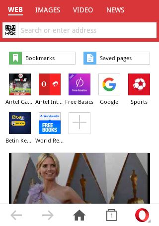 |
| Start Page |
The menu has also undergone some major changes. It’ now much thinner and gone with the wind is the reload button. In its place now there’s the cosy home button. To reload a page, you’ll have to settle with using the “pull-down” gesture or the reload button on the address bar.
The opera button has also been pushed to the far right and it’s pop up menu, well, that has been dumbed down. You get a huge data savings button, the main selling point of the app, then just below it you get your more useful buttons shrunk to oblivion (history, search, share, exit). They however do make a point of telling you what these mysterious icons do using some handy bubble notifications once you start using the browser.
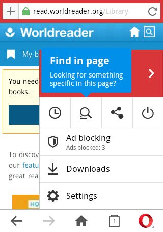 |
| Bubble Notification |
Following down with the menu, you get a new entry, the Ad blocking button. I’m not sure why they had to put this here, bragging rights maybe seeing the pointless ad counter. I’d actually have preferred to have the now defunct Bookmarks and Saved pages buttons in its place seeing that they’re bound to be used more regularly.
Oh wait, they put these two strange fellows on the start page to rule above the speedy dials. That’s very odd if you ask me, because now you’ll be forced to go to the start page every time you need to access a bookmark or a saved page. Sigh. Fortunately, they spared the Download and Settings button. As you might guess, am not a big fan of this menu at all. I think we can agree on the older one was more intuitive.
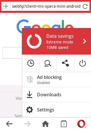 |
| Pop up Menu |
There’s also another pop up menu though this one is small and somewhat hidden. I only discovered it by mistake. It’s on the back button arrow though you’ll have to long press to bring it up. It gives you quick access to your entire history and speed dials.
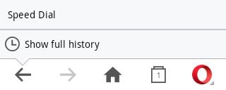 |
| Back Button Pop up Menu |
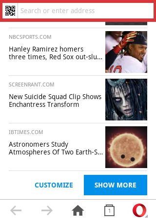
Another major change is the Combined Address and Search Bar. This may be convenient for some but I’m sure it’s a total headache for some like me. Here’s the problem with this sort of marriage: if you just want to type a URL and proceed to the page, the bar will still try to auto-suggest or auto-complete (from your history), making the typing severely sluggish.
Another thing, it’s not possible to modify/edit a search term after you open a web page from the search results since its replaced by the url; you’ll have to retype the whole thing all over. Of course you can just go back and edit it on the search box but this just a case of habit carried over from the old Opera Mini.
These two things are mighty annoying, and it’s the single most reason I find myself using the old opera mini despite the ads and the occasional reminder to upgrade.
 |
| Combined Address/Search Bar |
As a consolation, the search can now be refined into web, images, video and news results. It’s hard to notice this at first but you soon realize when you get image results by mistake. As it happens, it’s very easy to switch to image search without knowing since the switches are placed directly above the bar where you type. It has happened to me more times than I can remember.
Another thing, these searches only work with Google, so if you use another search engine they’re as good as useless. On a good note though, saving a page, bookmark, speed dial or a home screen shortcut has been made very easy. Now, you’ll only have to use the plus button just beside the address bar for any of these four.
The plus button will only come up after a page has been loaded otherwise you get the QR Code Scanner button which I might add is a useful addition seeing these codes are fairly common nowadays.
 |
| Refined Search Results |
The start page still features the usual speed dials albeit smaller in size. Editing the speed dials now requires you to long press and drag them to the top to edit or remove. I prefer the previous little x’s on the dials for obvious reasons – dragging stuff to the top is too tasking. Below the speed dials, you’ll get an automatic news feed from popular sites like BBC, ABC, Guardian and ESPN just to mention a few.
Some may find this intrusive not to mention a data waste, in which case you can disable it from the settings (Advanced > Start Page Content > Speed Dial only). If you prefer to keep it, make sure you scroll to the bottom and customize the kind of feed you want. You can choose from which country the feed should be sourced from and the kind of sites that interest you. Currently, there are only a handful of countries that are supported.
 |
|
| Automatic Feed |
Switching between tabs has been revamped with some fancy animations and gestures. On average now it should take you more steps, swiping to be exact, to get to a previously opened tab, that’s if you’re the type that opens multiple tabs (4+). Closing a tab is as simple as swiping it’s window up and if you happen to close the wrong tab, worry not. You can now reopen a closed tab using the tab page menu found in the bottom right. From the same menu you can also choose to close all tabs.
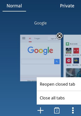 |
| Switching Tabs |
In the tab page, you can now switch to a Private Mode, something that had been sorely missing for years. No browsing history will be saved and that’s about it. It’s however not private in the strict sense since data has to be still compressed by servers before being sent to you. Then again, am not aware of their policy on this kind of issue since everything has to pass through their servers first. Also for obvious reasons, you can’t reopen a closed private tab.
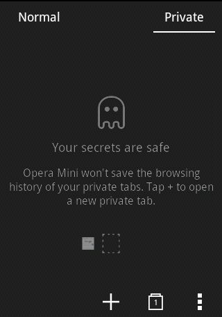 |
| Entering Private Mode |
The upload manager or file manager got a face lift too and not only looks good but also works superbly. Aside from the typical file picking tasks, you can now also take a picture straight from there and compress it. More on that later. You can also choose from three layouts including list, thumbnail and full image. If you’d rather use a different file manager, you can launch the system dialog from the menu and choose the app of your choice.
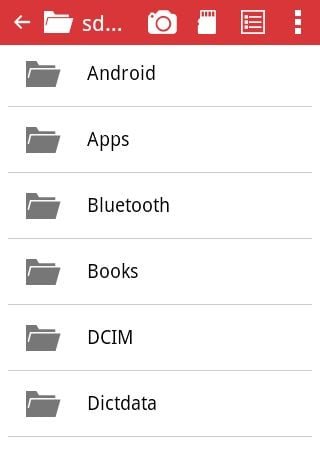 |
| Upload Manager |
One of the best things about Opera Mini has always been the ability to save pages for offline access. The saved pages menu has been reworked and to be honest, it’s one big improvement. The saved pages now appear as large thumbnails and are now arranged chronologically rather than alphabetically, making them easily identifiable. Lastly, you may have noticed the “thumb-scroller”. This is a welcomed addition as it makes scrolling those long pages a la Wikipedia more bearable.
Page Loading and Performance
In terms of how it performs, there’s no noticeable change that I’ve observed. Pages still load pretty fast and the experience is overall quite smooth just like in the old one. There are however some minor changes in how the pages load.
There’s this “heartbeat-like” animation of the loading page URL/Icon that I find completely unnecessary and an ad block notification icon that alerts you on how many ads it has blocked on any page containing ads. I also find that unnecessary though am not complaining.
There’s also some site specific change. Like for instance opening a Google Playstore link will instead launch the app. I have to say, I prefer the old days when I could get some quick details about an app before heading to the store app.
In other matters, this new opera is taking your data savings very seriously. There’s now a whole page of settings dedicated to tracking your data use as well as tweaking the compression parameters. Featured here is the extreme mode which will boost data savings though it may break some pages, the image quality setting and the much hyped ad blocker which works splendidly.
You can now also opt to save data when on Wi-Fi as well as boost videos. I’m not sure how this video boost works but apparently it compresses the video reducing the number of times it has to buffer.
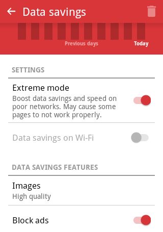 |
| Data Savings Page |
Still on saving data, it’s now possible to shrink (compress) pictures that you’re uploading to a site. We know cameras to typically produce very large size pictures despite compressing them, so this will not only save some valuable data but also lessen the need to use other apps to compress pictures before uploading them.
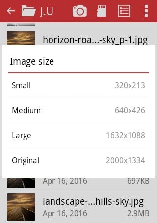 |
| Compressing Image before Upload |
On file access, with the new opera mini it’s now possible to save to or upload from the SD on devices using Android 4.4.4 (KitKat) or higher.
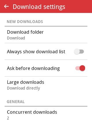
The download manager has also been improved considerably and its possible now to have multi-threaded downloads. There’s no maximum in the amount of concurrent downloads but the default is two. This can be changed in the settings but I would advise against choosing the unlimited option if you typically download large files. A dedicated download is better suited for that kind of thing.
It’s also now possible to undo deleted downloads. This can only be done in the download list and it’s valid only for a short window period after you delete an item and an undo button pops up in the screen.
Settings
The settings haven’t been left behind and are now more robust. Most apparent is the “Sign in to Opera” which is the successor to Opera Link – a service that used to allows you to synchronize your bookmarks, speed dials and search engines between all your phones and computers. When you sign in, the home button will be replaced by the sync button from where you can import stuff from your other devices. Quite handy if you ask me, though I stopped using their desktop variant.
 |
| Sync Button |
Some of the other additions include the app layout, the previously mentioned theme, a full screen mode and a night mode. For the app layout you get three choices: classic, phone and tablet. Classic layout is the default layout that you’re familiar with, suitable for one hand use.
The phone layout scraps the bottom menu and adds the opera and tab button next to the address bar. Seems like a really efficient layout if you can get used to it. The tablet layout is similar to the phone one, only this time you get the traditional tabs, kinda like those you see on a desktop browser.
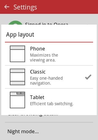 |
| App Layout Settings |
It’s also now possible to choose how to open new tabs. In the older version, tabs used to open only in the background but now you can set them to open in the foreground i.e. if you choose to open a link in a new tab, the app will automatically switch to that tab.
One place you’ve to hand it to the Opera team is in the language selection. You’ll most certainly be sorted if you’re not a native English speaker. I mean they even got my favourite language here, Swahili, though I wouldn’t dare switch to it owing to the amount of novel words I encountered there. Still, very good for business if you ask me.
In the new download settings it’s now possible to choose a download folder and also to allow for multiple downloads. If you’d rather live without that just set the concurrent downloads to one. You can also reserve large downloads to be downloaded when on Wi-Fi only.
 |
| Download Settings |
Down below there’s the advanced settings, somewhere I’ll advise you to make a stop by. It’s here where you can disable the automatic feed on the start page and in addition disable usage statistics if you’re worried about your privacy.
You can also enable subscription feeds from here, after which you’ll get a speed dial labelled feeds. I was actually very worried that they had scrapped off the feed system the first time I used this new opera. You can imagine my reprieve when I stumbled on this.
Finally, it’s now possible to set Opera Mini as the default browser so that all links will open through it. You can do that from the settings or from a notification that you’ll get soon after using it for a while.
Mysterious Speed Dials
You may or may have noticed this, but Opera is now adding speed dials to your start page. I presume this is how they make their money since all the custom speed dials they’ve pinned for me are from commercial entities – think online shopping malls and sport betting sites.
I do neither of the two so I always make a point of deleting them only for them to reappear a couple of days or weeks later. I’m not impressed with this behaviour and if you ask me it’s doing more harm than good. It makes the app look cheap and even malicious to some extent.
A setting to opt in into these “suggestions”, similar to the one they have for the automatic feed would have been the right way to go, and while they’re at it, giving people the choice on the kinf of sites they want would translate to even more clicks and better traffic for those sites. Think about it, what’s the likelihood that an average Joe or Jane is into sports betting enough to open these links from here. Slim at best.
Final Words
There’s no doubt that the new Opera mini is a far much superior product compared to its predecessor. However, some minor pitfalls here and there are ruining what would otherwise been an almost perfect app. To sum it app, I would say it clearly has the vision but lacks the simplicity and efficiency cemented by its predecessor.
Haven’t upgraded yet? Download it from the play store.
